Negative Space Is Part of the Picture
Negative space in art helps you see how unpainted areas balance a composition, guide attention and shape the subject without needing a hidden meaning.
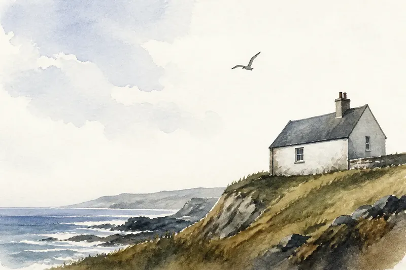
A white margin around a small ink drawing can feel as active as the black lines inside it. Negative space in art is the unpainted or unoccupied area around and between forms, and noticing it helps explain how a picture holds together. Rather than treating that area as a blank with a secret message, describe what it does in relation to the shapes beside it.
See the space as a shape
It is easy to name the things in a picture: a cup, a hand, a doorway. Try naming the areas that those things leave behind as well. The wedge between a bent arm and a body, the strip above a roof, or the opening inside a handle each has an outline of its own.
That outline is not usually drawn, but it can still be inspected. Look at its width, direction, and relation to nearby edges. Does it taper? Does it form a triangle? Is it nearly closed, or does it open towards the edge of the image? These observations describe visible relationships, not an imagined object hiding in the gap.
A useful everyday analogy is the space between furniture in a room. A chair’s position changes the route through the room; the open floor is not merely what remains after the chair is placed. In an image, the interval between shapes can similarly make a composition feel close, open, cramped, or orderly.
Notice how gaps balance the composition
Balance does not mean that both sides of an image must match. A large, dark form on one side may be offset by a smaller form and a generous area of open ground on the other. The negative space contributes to that arrangement through its size, contour, and position.
Compare the area above a form with the area below it. If the upper gap is shallow and the lower one deep, the form may seem to press upwards or sit close to the bottom edge. If open areas on either side differ, the subject may feel shifted rather than centred. These are ways to describe the effect of placement, not claims that every viewer must feel the same thing.
Balance can also be uneven on purpose. A tightly packed cluster against a broad expanse of open paper creates a different rhythm from shapes distributed evenly across the picture. Ask what the contrast in occupied and unoccupied areas makes your eye do: pause, cross the image, or return to a particular form.
Trace the route your eye takes
Negative space can direct attention by creating a channel between forms. A sliver of background may lead towards a face; an opening between branches may reveal a distant patch of colour. The space does not act alone. Its direction becomes legible because edges, contrasts, and neighbouring shapes give it a route.
Follow that route without rushing to interpret it. Start with the most prominent form, then notice the next gap your eye enters. Does the gap point towards another object, widen into the background, or stop at a strong edge? If the eye seems to leave the image, check whether a line or open band carries it towards the border.
In a crowded composition, small gaps may separate overlapping forms and keep their contours readable. When those gaps narrow or disappear, the objects can appear to merge. Conversely, a broad opening can make two nearby forms feel disconnected. Describing the change in distance or separation is more precise than simply calling the picture busy or empty.
Describe the relationship without inventing a symbol
A blank area may matter without standing for anything beyond its visible role. It can give a figure room to face into, separate a group from its surroundings, or make a dark mark look more isolated. Those effects are already meaningful formal choices; they do not require a claim that the gap secretly represents loneliness, freedom, or another fixed idea.
Keep three kinds of statement distinct. First, say what you can see: “A narrow wedge sits between the sleeve and the torso.” Then describe its relation: “It widens towards the elbow and is darker than the surrounding paper.” Finally, state a cautious effect: “That opening makes the bent arm easier to read.” The last statement is an interpretation, but it remains tied to observable evidence.
Context can still matter. A particular image may invite symbolic readings through its subject, setting, or repeated visual choices. If you make that case, point to those details rather than assigning a universal meaning to empty space. The first task is to notice what the area does in this composition.
Use a simple looking sequence
When a picture feels hard to describe, take a few moments to map its open areas before naming an overall mood. This short sequence keeps attention on visible choices:
- Locate the largest open area. Notice whether it sits above, beside, or around the main forms.
- Find one smaller gap. Look between objects, inside a loop, or where a form meets the edge.
- Describe its outline. Use ordinary terms such as wedge, band, pocket, curve, or narrow opening.
- Compare its edges. Say which nearby contours create the gap and whether it narrows, widens, or changes direction.
- Track its effect. Explain whether it separates shapes, directs the eye, or changes the apparent balance.
Say you are looking at an invented picture of a red kite above a low roof. You notice a triangular patch of sky between the kite’s tail and the roofline. Describing that patch as wider near the top and narrowing towards the roof gives a reader a clear account of the composition; saying it “means escape” would need further evidence from the picture.
What should you look for in negative space?
Is negative space always white?
No. It can be coloured, shaded, patterned, or occupied by a background scene. The term describes its relationship to the main forms, not a particular colour or material.
How can I tell where a shape ends and the space begins?
Follow the boundary that separates a form from its surroundings. In some images, overlapping outlines make that boundary ambiguous; describe the area as it appears rather than forcing a clear division.
Does negative space have to be empty?
No. A gap can contain background details and still function as space around a foreground form. What matters is how those details and boundaries affect separation, balance, or attention.
How do I avoid reading too much into a blank area?
Begin with its visible shape and position, then connect any interpretation to other choices in the image. If you cannot point to those choices, describe the formal effect without assigning a hidden message.
Let the gap sharpen the description
Looking at negative space does not mean ignoring the subject. It means seeing how the subject depends on the areas around it. A narrow interval can make two forms distinct; a broad one can give a small mark room to command attention. Once you can name the outline, placement, and effect of a gap, your description of negative space in art becomes more exact—and the picture’s structure becomes easier to see.